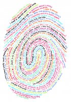
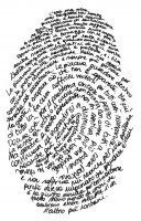
now let's get one thing straight. i'd never go on to assume that anything i'd ever come up with is even close to original or revolutionary. but it still feels funny when you come up with something, no matter how good or bad it really is, only to see it done already. richard holley originally fueled this re-imagined project by daniel eatock.
having seen what i (presently) think is good graphic design and looking back at my poster, i can see the things that could really be improved in my first poster (sorry lpci folks!), especially the type. i still think the concept is ok though. and as i said, it's been done. so humblepied i have been, albeit ignorantly at the time. and not for the last time i suspect, so this is round one.
exhibit a (the basis for my poster):
exhibit b (some of the holley portraits on eatock's site):
i guess on one level it's nice to know that i came up with my thing independently and in that sense it's a bit validating. but i can also see how that could be seen as a defense mechanism or worse on some level. this, like everything, is part of the learning process and i like to think (hope?) that even the most experienced and professional designers go through the same thing. it probably isn't accurate to label this round one, ha ha.
i've come to terms with the idea that there's always someone better but there's always some worse out there. i guess all one can do in the ensuing rounds is aim to land on the former side of that little credo.


No comments:
Post a Comment